 |
||||||||||||||
site information: past layouts & current designAlthough Isshou-ni.net is still new, it's still gone through its bout of massive changes. So I thought I'd share them here. If you have any questions about any of the effects here or coding used, please do not hesitate to ask. I cannot make you a layout of your own but I may be able to direct you to some useful tutorials. :) Click on the images to gain a larger preview and learn about its construction.
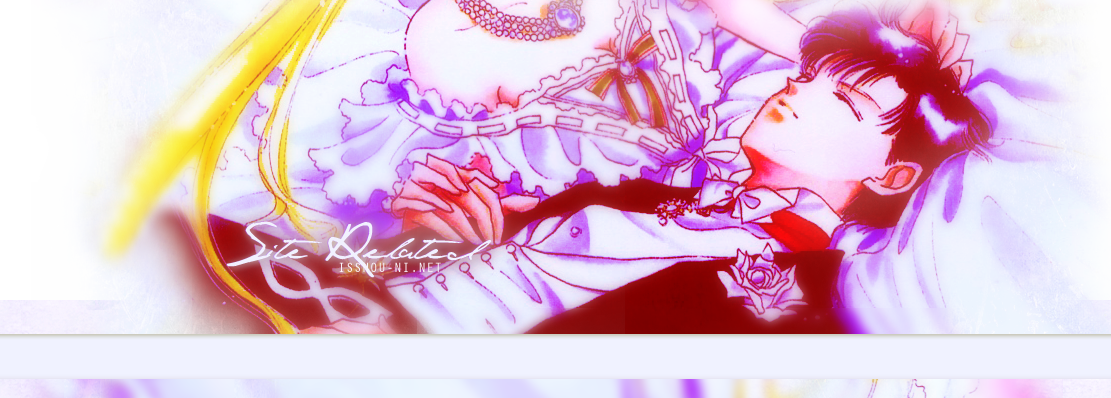
Version 4Featured: Seven edited artbook images of Usagi & MamoruOnline:Early December - About: I have this strange tick where I always need to try something new when I make a layout and this time I wanted to go in a completely different direction than the previous layouts. Instead of going for the complicated collectives layout, I thought I would try a more general approach and use a banner. But if I was going "simple" (or so I thought at the time) I wanted to make it special enough to follow my previously fancy layouts. So a different layout per section! This became more bothersome than I thought because I needed to use two different backgrounds coded atop one another, and seemless edges, which was a pain. Quick loading time was my objective, so I separated a lot of pages in the galleries and eliminated the thumbnails in the navigation pages. It's difficult to make such popular images look unique for a layout, so I went for unusual cropping, which I tend to like in general. Images were rotated, chopped and seamed together, as well as zoomed in and cropped up close. Without meaning to, somehow most of these images have Usagi & Mamoru sleeping! Version 3Fullsize? Click for larger previewFeatured: Manga colouring of Usagi Online: Early September - Early December About: Blue again, not intentional. I had originally coloured this manga for another site but it did not work out so I ended up using it for myself. I did the manga colouring myself so I couldn't waste all the hard work. :P I wanted to stay away from overtly fancy so I eliminated a lot of the fancy pop-up galleries because it was just not practical for large images. I also changd the navigation around a bit but other than that, things stayed the same. Unlike in the previous layout, I eliminated a lot of the bright colors and stayed more in a somber mood this time around. Version 2Fullsize? Click for larger previewFeatured: Usagi & Mamoru from the artbooks Online: June - Early September About: This layout was a long time coming. As much as I may have loved Ver. 1 when it was made, I get incredibly bored very fast. This whole current layout and coding is insanely epic. This layout is originally from a advert I had made several months ago. However, my laptop crashed and I lost the .psd file and was too crushed to make it all over again. Eventually I forced myself to make another one, slightly different but with that same overall feel. The construction and format of this design is an homage to collective sites, a world that I used to be very much apart of ten years ago. I think these website owners are the most talented bunch out there and truly create pieces of art with their layouts. They are also riddled with complicated CSS codes, div layers and javascripts -- everything I wanted as well! Version 2 is full of javascripts, overlaping div layers, millions of css codes and a hell of hours of frustration. I have literally spent months on this new layout, not mentioning that I had to convert all of the old pages to the new ones. -_-; Hopefully it was worth it? Version 1Fullsize? Click for larger previewFeatured: Usagi & Mamoru from Act 5 Online: January - Early June About: Version one was my first return to the website world & coding in about eight years. I needed to start off simple because I could hardly remember all of that intricate CSS & Javascripts. Also, I had not created layouts in Photoshop for years and I really was not sure how elaborate I could go. This layout featured a colored manga by simplysailormoon which I think tweaked and toyed with to turn into a header. When I was first creating this site, I knew that I wanted this scene from the manga. The quietness and stillness of it pulled at me. The banner format also allowed me to use tables & div layers.
|
||||||||||||||


